Power BI Python Visualizations – Adding a Vertical Line to a Graph
March 24, 2022

Power BI has a great selection of visualizations that are both incredibly easy to implement, and cover most of the functionality that users have grown accustomed to. However, there are some scenarios that fall outside of the abilities that the Power BI native visualizations offer, as well as visualizations currently offered in the Visualizations Marketplace. Luckily the platform is extensible and allows users to leverage Python and R script visualizations along-side native visualizations in reports and dashboards. These are considerably more difficult to implement, but offer unparalleled control and functionality in situations that require it.
Recently a client asked me to re-create a visual in Power BI that they built using Microsoft Excel. The visual contained vertical lines marking various events that gave context to the data being graphed. While I found a few workarounds that approximated this functionality, none ultimately met their criteria, so I decided to create the visualization using Python. I decided to document how I accomplished this, in hopes that it is useful to others.
This article assumes that you have basic experience using Power BI and Python. Software requirements include Power BI, Python, matplotlib, and pandas. All Power BI Python visuals require that these are installed. If you are new to Python development, you may have to install these. There are lots of tutorials online (like this one), but once these dependencies are installed, you should be able to follow along with no prior Python experience.
Install Python: https://www.python.org/downloads/
Install matplotlib: https://matplotlib.org/stable/users/installing/index.html
Install pandas: https://pypi.org/project/pandas/
- Getting Started
- Download and open the completed Power BI pbix file.
- If it looks like this, one of the above dependencies is not working correctly. You can click See Details for more information.
- If it looks like this, Python is working correctly, and you can proceed.
- If it looks like this, one of the above dependencies is not working correctly. You can click See Details for more information.


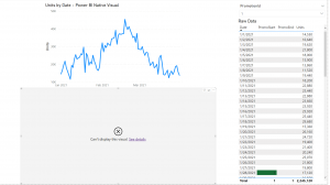
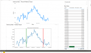
- In this exercise, we will be recreating the bottom chart.
- Create a new tab on the report by clicking the “new tab” button at the bottom left of Power BI
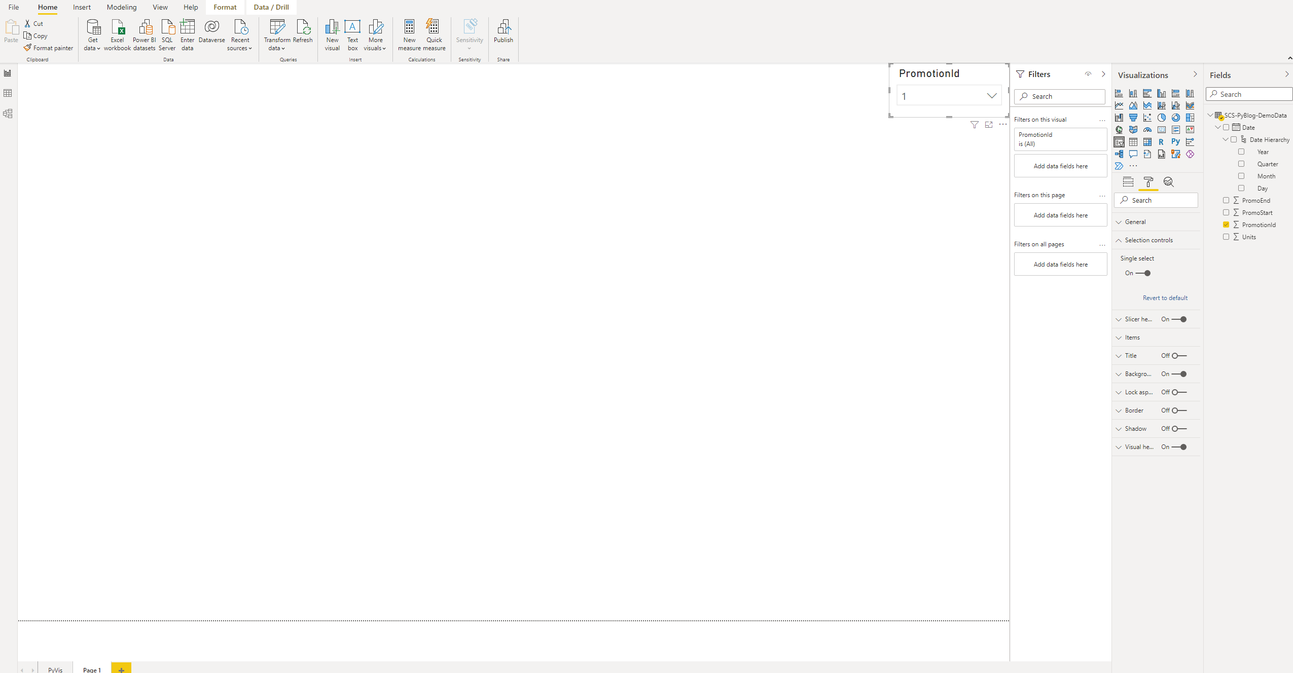
- Create a slicer on the page for PromotionId.
- Open the fields pane on the far right of your screen
- Expand the dataset “SCS-PyBlog-DemoData”, and select PromotionId
- Select the Slicer Visual to change it from the default visualization (bar chart for me), to Slicer.
- Change the slicer display type to dropdown by clicking the down arrow in the upper right of the visualization, and selecting dropdown.
- In the format tab of the Visualizations pane, expand the Selection controls section, and enable Single Select. (Due to the way the data is structured, combining promotions should be disallowed for analysis.)
- Resize the slicer, and position it out of the way. The result should look like this:
I decided to include a slicer in this exercise, because in the real world, datasets will almost always require some sort of in-report data manipulation at the user level. This is a page level slicer, so it will filter any object on the page unless we tell it not to – even for Python visualizations like the one we are creating.
- Create the Python Visualization
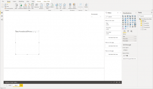
- Add a new visual by clicking anywhere on the report page then selecting the Python visualization (the “Py” icon in the Visualizations area). A greyed-out box will appear on the report canvas
- Add the required fields to the visualization by clicking the new visual, then selecting Date, Units, PromoEnd, and PromoStart.
- A default tile will be created, but the chart will be blank
- By default, the date will be created as a hierarchy. In the Visualizations pane, click the down arrow, and change it from Date Hierarchy, to Date. It should now look like this:

- Add the Python script:
- When you click the visual, it should bring up the Python Code Editor.
- If it doesn’t, there will be a black bar at the bottom of the application. Click the up arrow, and it should display.
- Copy and paste this into the code editor, underneath any existing text:
import matplotlib.pyplot as plt
import pandas as pd

fig, ax = plt.subplots(figsize=(12, 6)) #Create the figure, and set its size
df = pd.DataFrame(dataset, columns = ['Date', 'Units']) #Populate Main Dataframe

df['Date'] = pd.to_datetime(df['Date']) #Format Date for X-Axis
ax.set_ylabel("Sales Units") #Add Y Label
ax.set_title("Sales by day for Promotion Period") #Add Chart Title
ax.plot(df['Date'], df['Units'], linewidth=3) #Plot data to the chart

#PromoStart Vertical Line
vlsa = pd.DataFrame(dataset, columns = ['Date', 'PromoStart']) #Populate Vertical Line PromoStart Dataframe
vlsa = vlsa.dropna() #Remove Nulls
ps = vlsa['Date'].values[0] #Get Date of Promo Start
vlps = pd.to_datetime(ps)
ax.axvline(x = vlps, color='g', linewidth=4) #Add line to chart

#PromoEnd Vertical Line
vled = pd.DataFrame(dataset, columns = ['Date', 'PromoEnd']) #Populate Vertical Line PromoStart Dataframe
vled = vled.dropna() #Remove Nulls
pe = vled['Date'].values[0] #Get Date of Promo End
vled = pd.to_datetime(pe)
ax.axvline(x = vled, color='r', linewidth=4) #Add line to chart

plt.show() #Show the chart
Before going on, let’s review the code that you just entered.
The script starts by importing the modules it uses:
import matplotlib.pyplot as plt
import pandas as pd
It then creates a Figure and Axes, setting the size of the figure.
fig, ax = plt.subplots(figsize=(12, 6)) #Create the figure, and set its size
Power BI requires that your imported data must be in a pandas data frame. It will automatically create a data frame for you that is called “dataset”, which contains all the columns that you add to the values section of the Python visual. Here we will import the two columns that are needed for the line chart into a new data frame to show how it is done, but we could use the default dataset if we wanted to.
df = pd.DataFrame(dataset, columns = ['Date', 'Units']) #Populate Main Dataframe
Next, we will format the Date field, add a label to the Y-axis, and create a title for the chart. The second two lines are optional, but the dates probably won’t be legible if the first is omitted.
df['Date'] = pd.to_datetime(df['Date']) #Format Date for X-Axis
ax.set_ylabel("Sales Units") #Add Y Label
ax.set_title("Sales by day for Promotion Period") #Add Chart Title
This line of code plots the line onto the chart and sets its width.
ax.plot(df['Date'], df['Units'], linewidth=3) #Plot data to the chart
Next we will create the first vertical line, which I’m using to denote the start of a promotion in this example. If you have not already done so, navigate to the first tab, and review the dataset we are working with. There is a row for each day, unit sales, as well as one that denotes the promotion it was part of. There are then two more columns that show if the date was the start or end date for the promotion. This was an easy way to format the data, but you may need to tweak this section to work for your specific scenario if you are applying this knowledge beyond the scope of this example.
The first line creates a new pandas data frame, containing all the rows for the data set, but only the Date and PromoStart columns. The next line removes all rows that have nulls in the PromoStart field. Since each promotion in the dataset only has one start date, and the page level slicer (PromotionId) filters the dataset down to one promotion, this data frame will now only contain one row. Since there is only one row remaining in the DataFrame, the next line will just assign the first value it finds in the date column, and assign it to a variable. This is why we set the slicer to singe selection – if the default (multi-select) was used, it would still use the first data value, even though there are multiple start in the dataset.
#PromoStart Vertical Line
vlsa = pd.DataFrame(dataset, columns = ['Date', 'PromoStart']) #Populate Vertical Line PromoStart Dataframe
vlsa = vlsa.dropna() #Remove Nulls
ps = vlsa['Date'].values[0] #Get Date of Promo Start
If you are trying to apply this knowledge to another scenario, this section will be the main part you will need to modify. Essentially, find a way to get the X-Axis value you are tying to plot nto a variable so it can be referenced by the next section.
Next, we will format the value to match that of the X-Axis, and plot the vertical line using a method that was specifically created to do so – axvline. Here we also set properties for the line that is being created. I Set the color and width, but there are many more that can be configured.
vlps = pd.to_datetime(ps)
ax.axvline(x = vlps, color='g', linewidth=4) #Add line to chart
The next block of code does the same as the last, but for the second line we will be plotting. Note that in the first line of code (when the data frame is created) PromoEnd is being used. The only other differences are the names of the variables and the line color setting.
#PromoEnd Vertical Line
vled = pd.DataFrame(dataset, columns = ['Date', 'PromoEnd']) #Populate Vertical Line PromoStart Dataframe
vled = vled.dropna() #Remove Nulls
pe = vled['Date'].values[0] #Get Date of Promo End
vled = pd.to_datetime(pe)
ax.axvline(x = vled, color='r', linewidth=4) #Add line to chart
Lastly, we just need to tell the script to show the visualization that has been created.
plt.show() #Show the chart
- Run the Script
- In the upper right of the Python script editor, click the run button to run the script and generate the visual. Resize the Python visualization area to properly display the chart.
- If everything worked, you will now see the visualization on the page. If you see the grey box, click show details for more information.
- If you are still having issues, try to comment out all the lines, and add them back in one by one (running the script as you go). This will help you find where the issues are.
I hope you enjoyed this tutorial and were able to learn a bit about adding custom Python visualizations to Power BI. This post barely scratches the surface of what is possible with Python visualizations, but hopefully it was enough to get you started. If you are looking to continue to learn, here are a few Microsoft Learning modules that may be of interest to you:
https://docs.microsoft.com/en-us/learn/modules/explore-analyze-data-with-python/
https://docs.microsoft.com/en-us/learn/modules/python-install-vscode/
https://docs.microsoft.com/en-us/learn/modules/visuals-power-bi/
Documentation:
https://matplotlib.org/stable/tutorials/index.html
https://pandas.pydata.org/pandas-docs/stable/
Was this article too advanced? Here is a simple example that will guide you through these concepts.
https://docs.microsoft.com/en-us/power-bi/connect-data/desktop-python-visuals
Got Questions? Team SCS is here to help